ROKENBOK
Client: Rokenbok Toys


The Ask:
A few packages for Toy Fair based on current ones.
The Solution:
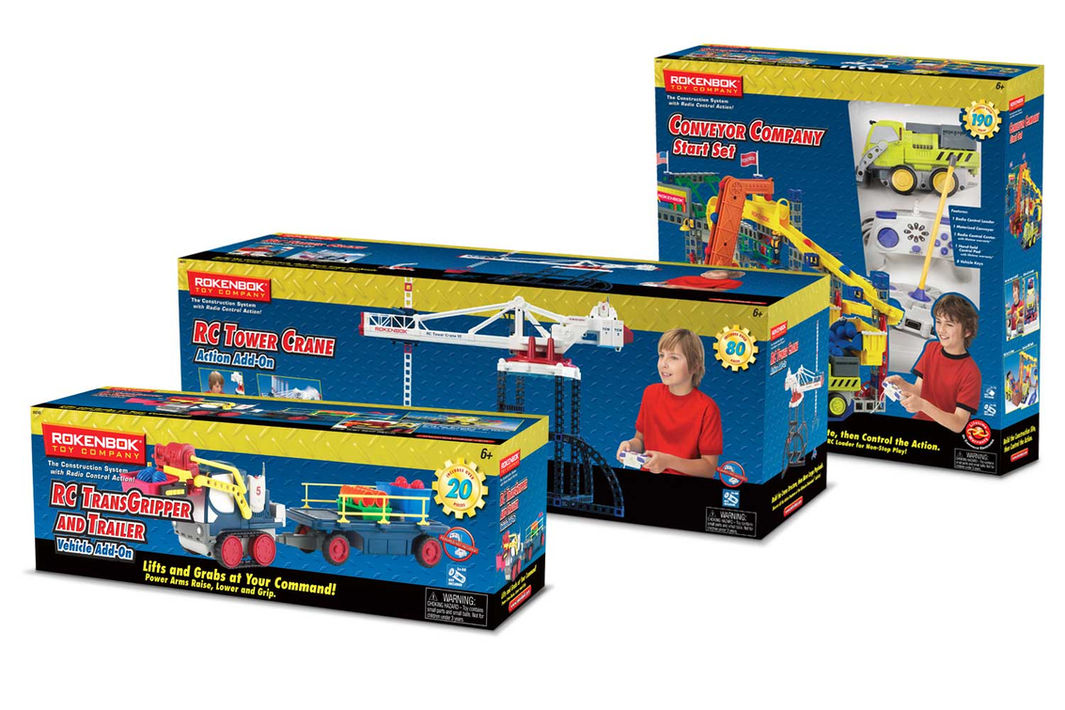
Refocused the package design. Established a brand vision through a visual and verbal hierarchy of retained and new elements.
Brand Clarity • Packaging • Print • Photo Direction • Retouching

– Christine Norris, Marketing Manager, Rokenbok Toy Company
… She took the time to find out …
The scope of the project increased to creating a packaging system. This is a unique toy play pattern, yet existing packaging didn’t address this. Consumers didn’t know this had both construction and RC.
There were many brand elements, but not used consistently. Additional elements were added to tell their story.
Product was photographed to best show the complexity of these toys, yet still be approachable.

PACKAGING BEFORE & AFTER GALLERY
PACKAGING COLLECTION GALLERY
A “junior” version of their RC/construction toys targeting 4 – 6 year olds. It needed to be reminiscent of the parent brand, but have its own identity.
ROK JUNIOR PACKAGING GALLERY

– Christine Norris, Marketing Manager, Rokenbok Toy Company
She is organized beyond any graphic designer …
"I would recommend Donna for a branding/design project because she (let me count the ways...
-
She took the time to find out who our customer was then she went out and talked to them before she decided what we needed to capture their attention for our packaging, what was missing, etc.
-
She possesses a high attention to detail.
-
She is organized beyond any graphic designer that I have come across in 20+ years in the marketing business.
-
Her ability to stick to production schedules, even when thrown a curve ball.
-
She was able to multi task and complete an entire line at one time.Donna was not only creative, resourceful and imaginative, but also highly organized, detailed and dedicated to each and every package/project that she worked on for Rokenbok Toy Company.
Contact Donna


